Volworks Methodology
Volworks Collar Analytics Guide
An evergreen reference for the analytics used in Volworks collar articles, the Collars Explorer, and Volworks collar reports.
Purpose of This Guide
Volworks analyzes listed and FLEX collar opportunities by comparing upside participation, downside protection, historical return behavior, drawdown risk, and market-implied probabilities.
This guide is designed to be a single reference document across Volworks collar research. Individual articles may highlight only a subset of the analytics, while the Collars Explorer and collar reports may include more detailed views.
Two Different Charts, Two Different Questions
Volworks uses more than one collar visualization. The two most common are the Cap vs. CER Map and the Cap vs. Drawdown Quad Chart. They answer different questions.
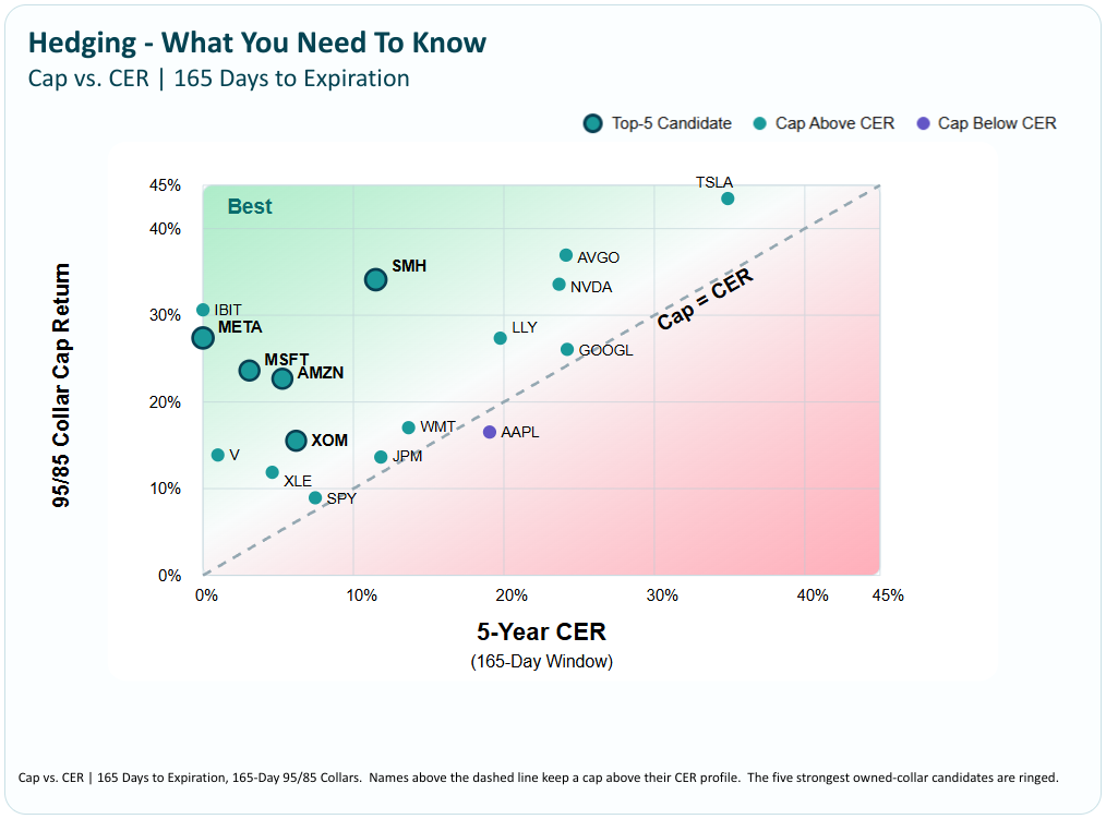
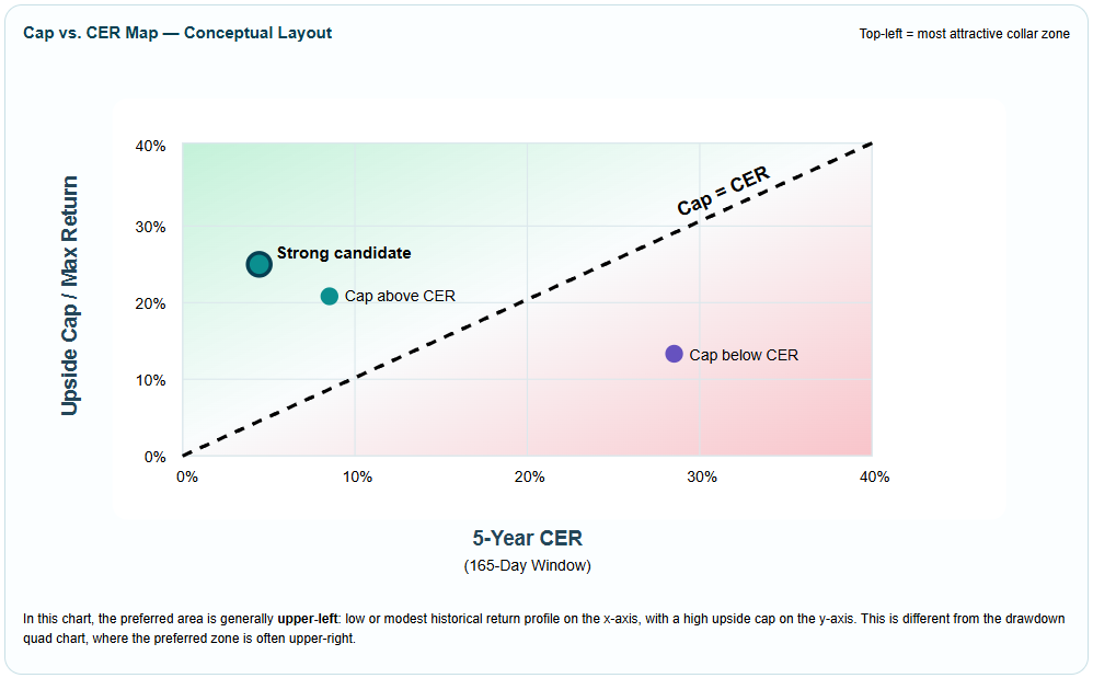
Cap vs. CER Map
Answers: Is the cap attractive relative to historical return? Top-left is generally preferred.
Cap vs. Drawdown Quad Chart
Answers: How much upside is retained relative to historical downside risk? Upper-right is generally preferred when drawdown risk is inverted.
Cap vs. CER Map
The Cap vs. CER Map compares the collar’s upside cap with the stock or ETF’s historical same-window return profile. This chart is especially useful when evaluating whether an existing position is attractive to collar.
In this chart, the preferred area is generally upper-left: low or modest historical return profile on the x-axis, with a high upside cap on the y-axis. This is different from the drawdown quad chart, where the preferred zone is often upper-right.
How To Interpret The Map
- Above the diagonal: The cap exceeds historical same-window return.
- Below the diagonal: The cap may cut into return history suggests was more likely.
- Top-left: The collar may be attractive because the cap is high relative to CER.
- Bottom-right: The cap may be less attractive because it may truncate expected return.
Cap vs. Drawdown Quad Chart
The Collars Explorer also uses a drawdown-based quad chart. This is a different visual from the Cap vs. CER Map.
In the drawdown quad chart, the x-axis is often inverted so lower drawdown risk appears to the right. That makes the upper-right the preferred area.
Core Collar Analytics
Max Return / Upside Cap
The estimated maximum return at expiration when the collar is initiated.
Protection Range
The downside band where the put spread is designed to provide protection.
Probability Above Cap
The options market’s implied estimate that the underlying finishes above the cap.
CER™
Volworks contextual expiration return: a five-year, recency-weighted average historical same-window return.
Cap Efficiency Ratio™
When CER is positive, upside cap divided by CER.
Cap Spread
Upside cap minus CER. Useful across all CER values, including zero or negative CER.
Cap Efficiency & Negative CER
Cap Efficiency Ratio is useful when CER is positive. When CER is zero or negative, the ratio can become mathematically misleading even though the collar may be economically attractive.
| Condition | Display | Interpretation |
|---|---|---|
| CER > 0 | Show numeric ratio | Cap Efficiency = Cap ÷ CER. |
| CER = 0 | N/M • CER = 0 | The ratio is not meaningful. Use Cap Spread and cap context instead. |
| CER < 0 | N/M • CER ≤ 0 | The ratio is not meaningful, but the collar may be favorable because the cap is not cutting into a positive historical return profile. |
Drawdown Analytics
Drawdown measures peak-to-trough decline. Volworks uses drawdowns because investors generally understand losses more intuitively than volatility.
Current 6M Drawdown
The largest peak-to-trough decline during the most recent six months.
Current 12M Drawdown
The largest peak-to-trough decline during the most recent twelve months.
Worst 6M Drawdown: 5Y
The largest rolling six-month peak-to-trough decline observed over the past five years.
Worst 12M Drawdown: 5Y
The largest rolling twelve-month peak-to-trough decline observed over the past five years.
EW Downside Beta™
EW Downside Beta measures how a stock or ETF has historically behaved during market declines. Unlike traditional beta, it focuses on downside market periods and weights recent observations more heavily.
| EW Downside Beta | General Interpretation |
|---|---|
| Below 1.0 | Historically declined less than the market during downside periods. |
| Around 1.0 | Historically moved broadly in line with the market during downside periods. |
| Above 1.0 | Historically declined more than the market during downside periods. |
| Negative | Historically moved opposite the market during downside periods. |
95/85 vs. 95/80 Collars
Structure selection should reflect both the analytics and the investor’s market view.
| Structure | Best For | Trade-Off |
|---|---|---|
| 95/85 | Investors seeking a balanced structure that preserves more upside participation. | Less protection depth, generally higher cap. |
| 95/80 | Investors who are more bearish or want a wider protection band. | More protection depth, generally lower cap. |
Volworks Collar Fit Labels
The Collars Explorer uses five qualitative fit labels to simplify comparison. These labels summarize the balance between upside cap, CER, Cap Efficiency, Cap Spread, drawdown risk, probability above cap, and protection characteristics.
The Cap Is Not Necessarily Final
A common misconception is that the upside cap is a permanent ceiling. In reality, listed-options collars can often be actively managed.
Short calls may potentially be repurchased, rolled, or repositioned depending on volatility, time remaining, price movement, liquidity, tax considerations, and investor objectives.
Investor View Still Matters
The analytics help investors compare collars systematically, but they do not replace judgment.
- If an investor is very bearish, a 95/80 collar or a more protective structure may be preferred.
- If an investor is moderately cautious but wants more upside, 95/85 may be more appropriate.
- If an investor wants to avoid stock-specific decisions, an index-level defined-outcome ETF may be considered, but Volworks collar analysis is designed for stock-by-stock evaluation.
Disclosures
This material is provided for informational and educational purposes only and does not constitute investment advice, a solicitation, or a recommendation to buy or sell any security or option strategy. Options involve risk and are not suitable for all investors. Past performance is not indicative of future results.
Volworks analytics are intended to support research and decision-making. Investors should evaluate any strategy in light of their objectives, risk tolerance, tax situation, liquidity needs, and overall portfolio.